


The merging of digital experience and physical hardware

Interaction design usually pertains to a digital experience, but here at Whipsaw the interaction design team must consider the relationship between the digital experience and the physical hardware that accompanies it. When the software and hardware become one, the result is a more intuitive and engaging product experience. The brand also benefits from the union of the two, as every touchpoint is optimized. Sometimes we find ourselves designing interactions on massive flat-screen TVs. Other times we’re working with a single multi-colored LED. And then there are times we’re designing interactions that involve several screens and physical products all working in concert together. Physical products have evolved over the past decade to be increasingly “connected” (meaning users have multiple ways of interacting with a product), but it’s a challenge to get these interactions right and not give users too many, often confusing, options. That’s where we come in. When products attempt to communicate too much with too little or stretch interaction methods across too many platforms, we must advocate for the needs of the user and get creative with our communication and interaction tools.
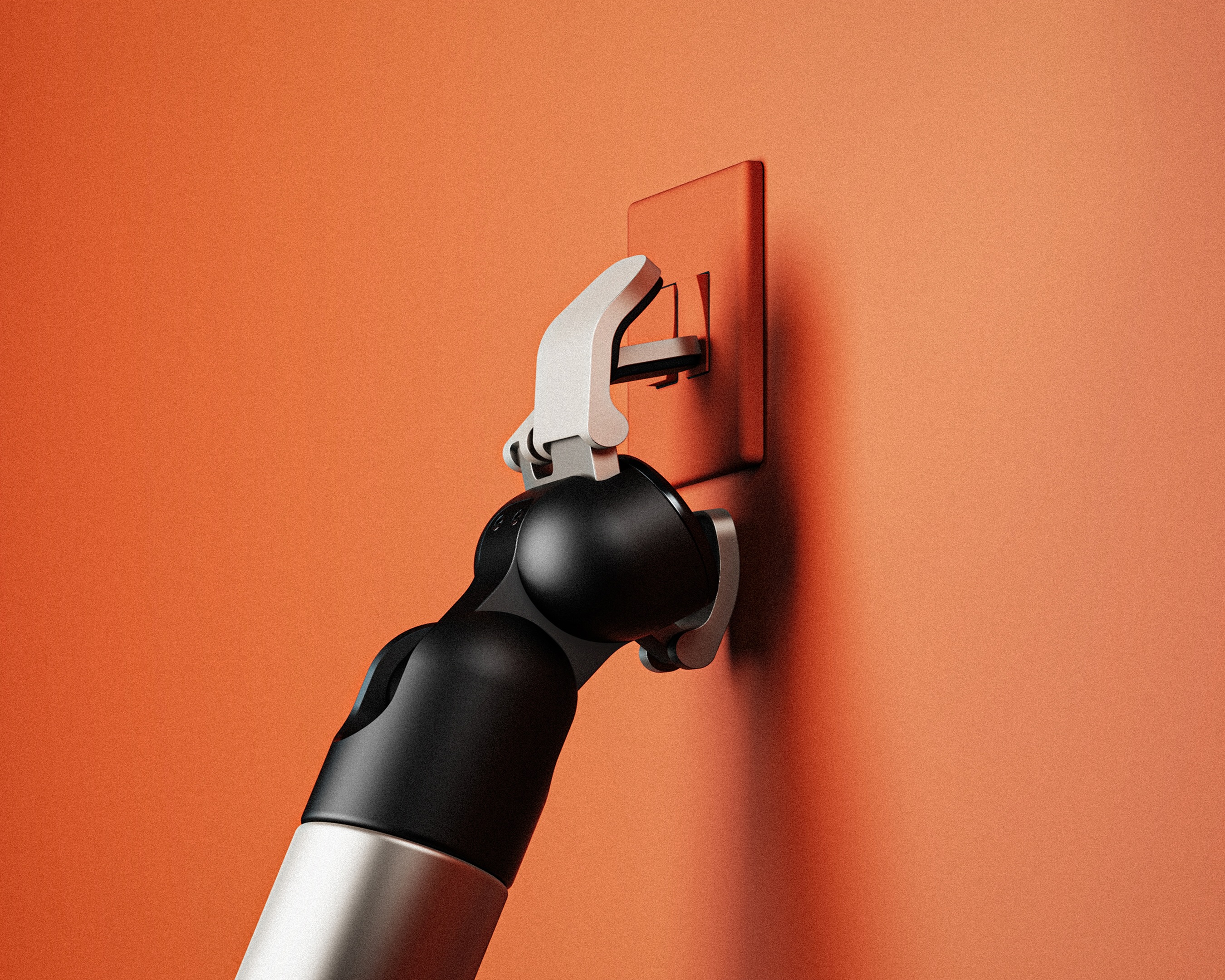
First, let’s take a look at what it’s like to design interactions with limited resources: aka, without a screen. What does interaction design even look like without pixels involved? It’s our job to make sure interactions don’t feel like a transmission of morse code requiring the user to learn a whole new language to engage with the product.
Consider the last time you interacted with a coffee maker. Unless you have a fancy IoT version, your interaction probably involved a series of buttons, beeps, lights…and maybe some finger drumming while you waited for your inputs to add up to a cup of coffee. There’s a reason these products are designed this way. It’s not that coffee maker companies are out to mess with our caffeine-deprived emotions; it’s that hardware design is often a game of penny pinching. In the hardware world, every light, button, pixel and vibration is an added cost. We’re therefore constantly trying to figure out how to communicate clearly with minimal inputs and outputs.
The interaction designer takes on the role of negotiator when working on these kinds of products. While the engineering team tries to make the product less complex, and the business team tries to cut costs, we always advocate for the user because that’s where demand starts. We’re on the ground ensuring interactions aren’t minimized to an indistinguishable series of flashes and beeps. We sit next to our engineering and industrial design counterparts and work closely with clients to weigh decisions about pixels, LEDs and buttons. Together, we ask ourselves:
How important is each interaction for what the product is trying to accomplish?
This leads us to research and strategic thinking that will determine how strongly we negotiate for an interaction. If the answer is “very” important, then we must try to preserve that interaction without compromising cost, risk and timeline. We may ask ourselves:
Are people willing to pay a few dollars more to have LEDs dedicated to making that interaction more clear?
Does the input for this interaction merit its own button, or can we use a double click on an existing button?
Sometimes we get to a point of questioning whether it makes more sense to ask the user to pay more or to think more. While technology has moved far beyond segmented displays and single flashing LEDs, cost is still a real barrier in hardware interactions, and it’s not worth designing products that are too expensive for anyone to buy. Balancing expense with usability involves negotiation and creativity as we weigh mental load on the user with technical complexity and product cost.
Now let’s consider the inverse scenario where we have not just a single LED and button, but many ways of interacting with the user across different platforms—not just web and mobile. Our projects may involve a web app, a desktop app, a device with a built-in screen, and a device without a screen. When working on such systems of products, the problem flips. Rather than focusing on how we’ll communicate, we begin by examining where we’ll communicate by asking:
Where does it make sense for users to do this interaction?
Can the same interaction happen on the device and on the app?
How do we design flexibility without redundancy?
Unlike other firms, we also pause to determine if there is a genuine need for an app—or if the client just wants one because everyone has an app these days. The deciding factor is if it will add real value for the user and if there are interactions that would take place on an app that wouldn’t occur on the device itself. We also consider if the user actually wantsthose interactions. Similarly, if we ask too much of the app and have no way of interacting directly with the device, we risk losing users who simply don’t want to deal with an app. The important thing is to never take any components for granted when thinking through interactions across products in a system.
Whether we have a near infinite number of pixels or a single LED, we always start our interaction design challenges by defining what the product is trying to accomplish. We don’t want to jump in and design interactions that overcomplicate the product’s intention and aren’t moving it towards its end goal.
We often use a variety of mapping techniques to figure out how, where and when things need to be accomplished as we work to define intentions. We map out each hypothetical interaction and scenario a user might want to experience with the product. Through this mapping process, we may learn we can’t possibly communicate everything to the user—and then the journey map becomes a tool we take back to the engineers and product managers to make a case for more interaction resources. Or we may realize none of the interactions really seem to merit an app. Either way, maps are a great starting point and create a logical framework for communication and negotiation with all teams involved in the development process.
Next, we get familiar with other products users would interact with in similar scenarios. If we’re designing products that live in an emergency room, for example, we look at what else exists in that environment and how those products communicate. From this we might notice that flashing LEDs are used to communicate serious problems but also scare patients in the process. We would therefore aim to use flashing LEDs sparingly in our design, rather than using them just to communicate that a device is running. Once we know the user’s existing interaction paradigms, we then start applying potential combinations of feedback to our journey map. We look at a scenario and question:
Does it make sense for this to be represented by three blue LEDS?
Does the user know to hold the button down when it starts vibrating in this moment?
Does this need to take place on the device, or could it exist in a separate app?
Prototyping these types of interactions involves more invention than connecting a few screens and making them clickable in Figma or InVision, but it’s still an important part of the process. Once we’ve come up with a creative way to prototype interactions, we quickly get our ideas in front of users and run through scenarios to pinpoint moments where product confidence gets lost. Testing gives us additional ammunition to negotiate for more resources if we find we’re still trying to communicate too much with too little.
While we work on interaction design problems across the board—from single LEDs, to apps, to systems of interaction—we have a soft spot for those nasty little problems with limited interaction resources and lots to communicate. When we do our job well, interactions feel like poetry. It’s a beautiful moment when we figure out how to infuse clear communications into a product without tarnishing the experience or adding a penny.
Share this article


.svg)