


The in-sink disposal is one of the most overlooked appliances in the modern kitchen. While cooktops, faucets, and refrigerators have all been reimagined, refined, connected, and made beautiful, the disposal has remained essentially unchanged for decades. A hidden motor, a wall switch, a rubber splash guard. Functional, yes. Designed, not really.
When Composer approached Whipsaw, the team already had a working prototype with a genuinely novel mechanism: a patented iris that opens and closes at the drain, and a mechanical lever that replaces the wall switch entirely. But a novel mechanism doesn't guarantee adoption. For a first-time founder bringing a product to market, every decision carries weight. The product has to be understood immediately, trusted instinctively, and desired before anyone reads a spec sheet. And with a public launch at KBIS 2026 on the calendar, the window to get it right was set.
Early inspiration came from an unexpected place: rocket turbo boosters. The founders' aerospace background led us to references with spiraling forms, visible ribbing, and densely engineered surfaces, imagery that carried real muscularity. Our first concepts leaned in that direction, but while they had presence, they did not look at home in a kitchen.
We pulled back and refined. Internally, we started calling the direction "nano architecture," after studying municipal wastewater treatment facilities whose massive barrel forms and attached modules shared a visual grammar with both the turbo references and the organic roundness of fruits and vegetables. That convergence, technical credibility softened by domestic warmth, became the design's backbone.
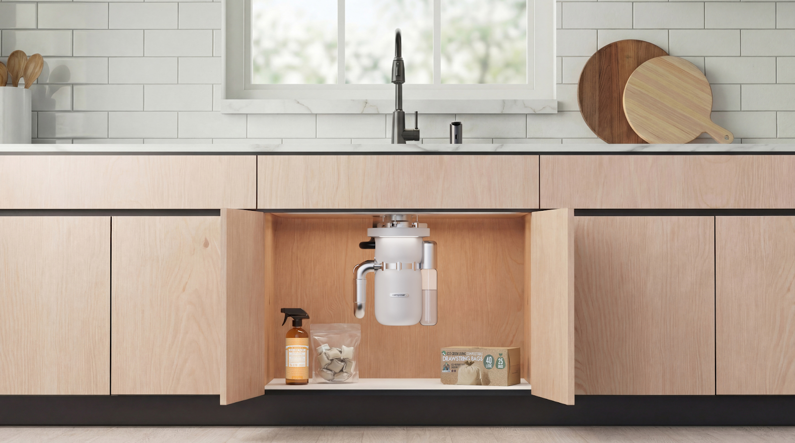
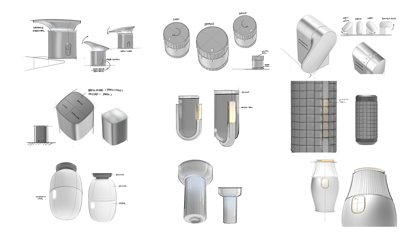
A disposal is a two-part product. There's the unit doing the work beneath the sink, and there's the control point at the surface. Both needed to feel intentional, and both shaped how we thought about the experience as a whole.
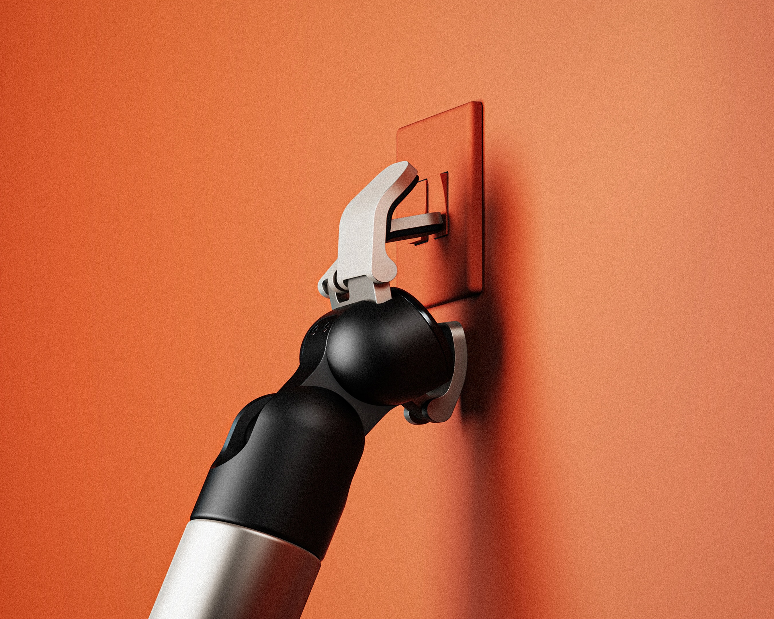
The lever was the subject of more discussion than any other element on this project. We started by having each team member log how they currently use their own disposal. The habits varied more than expected, and that process revealed a key insight: people don't always want to stuff food in, close, grind, and repeat. Sometimes you're clearing a full cutting board, and you need to load continuously. That observation pushed us to define three distinct lever states. In its neutral position, the iris remains partially open, roughly ten percent, allowing water to drain while catching larger objects like utensils. Lifting the lever opens the iris fully, giving you a satisfying tactile pull and letting everything pass through. Pressing and holding closes the iris, activates the grind, and injects water simultaneously. Release, and it springs back to neutral.
We explored well beyond levers during this phase. Knobs, ignition-key-style turns, rotary dials, and a wide range of interaction models for what we called the controller. The lever won on both intuitive logic and tactile reward, communicating state through position alone with no ambiguity. Length was another constraint that only surfaced through research: when we asked team members to photograph their own sinks, we discovered that a longer lever would collide with backsplashes and faucet handles in a surprising number of real kitchens. We prototyped multiple lengths to find the sweet spot: enough throw to feel satisfying, short enough to fit.
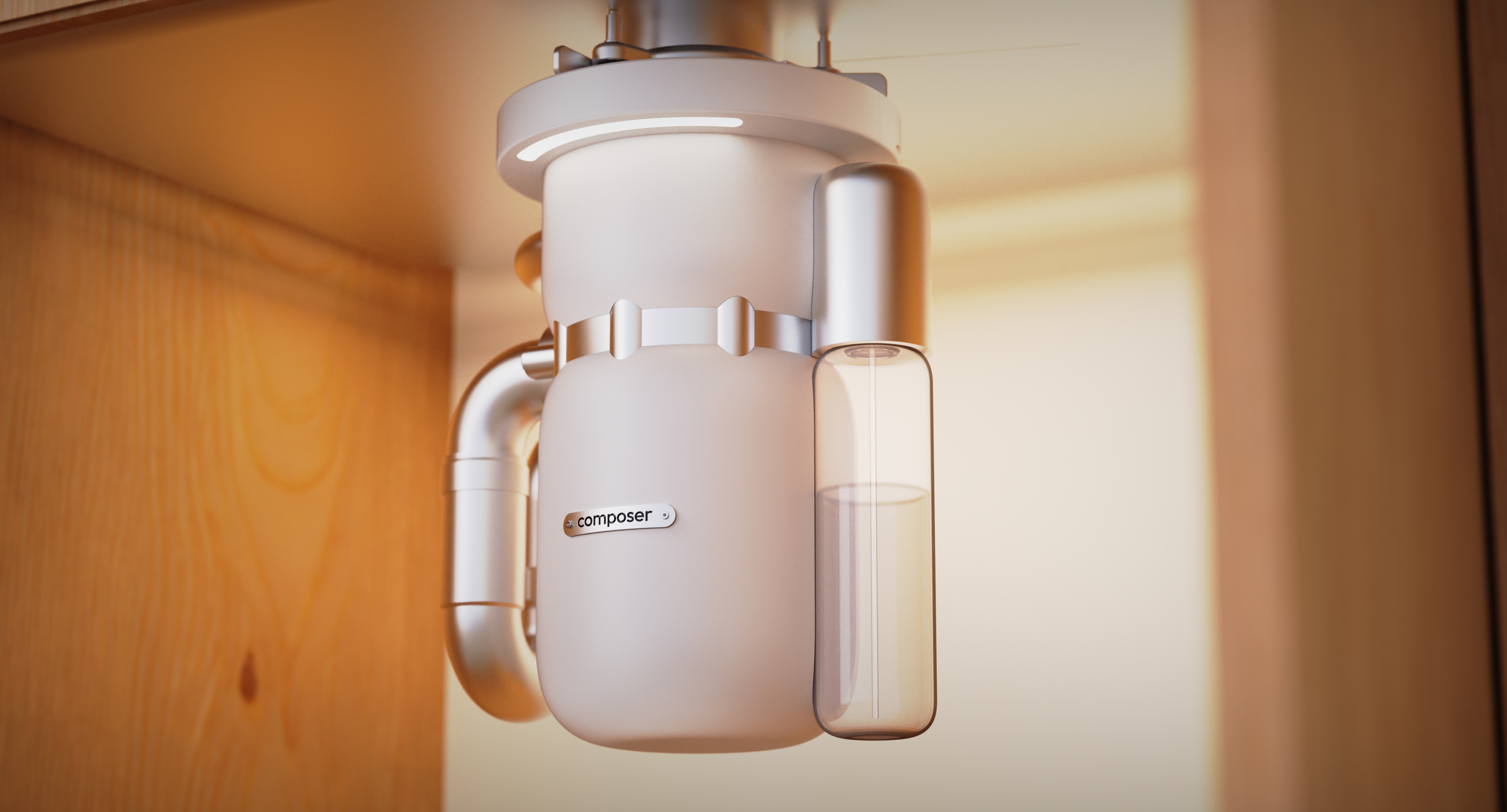
Beneath the sink, we saw an opportunity to extend that same care. The space under most sinks is dark, crowded, and neglected. We integrated a motion-activated light ring into the underside of the unit, a detail that wasn't part of the original brief but became one of our favorite features. It illuminates the cabinet for both installation and everyday maintenance, and paired with the Composer's form and color, it turns what is typically a forgotten cavity into something that feels considered. The interaction doesn't end at the drain. It extends to every moment someone encounters the product.
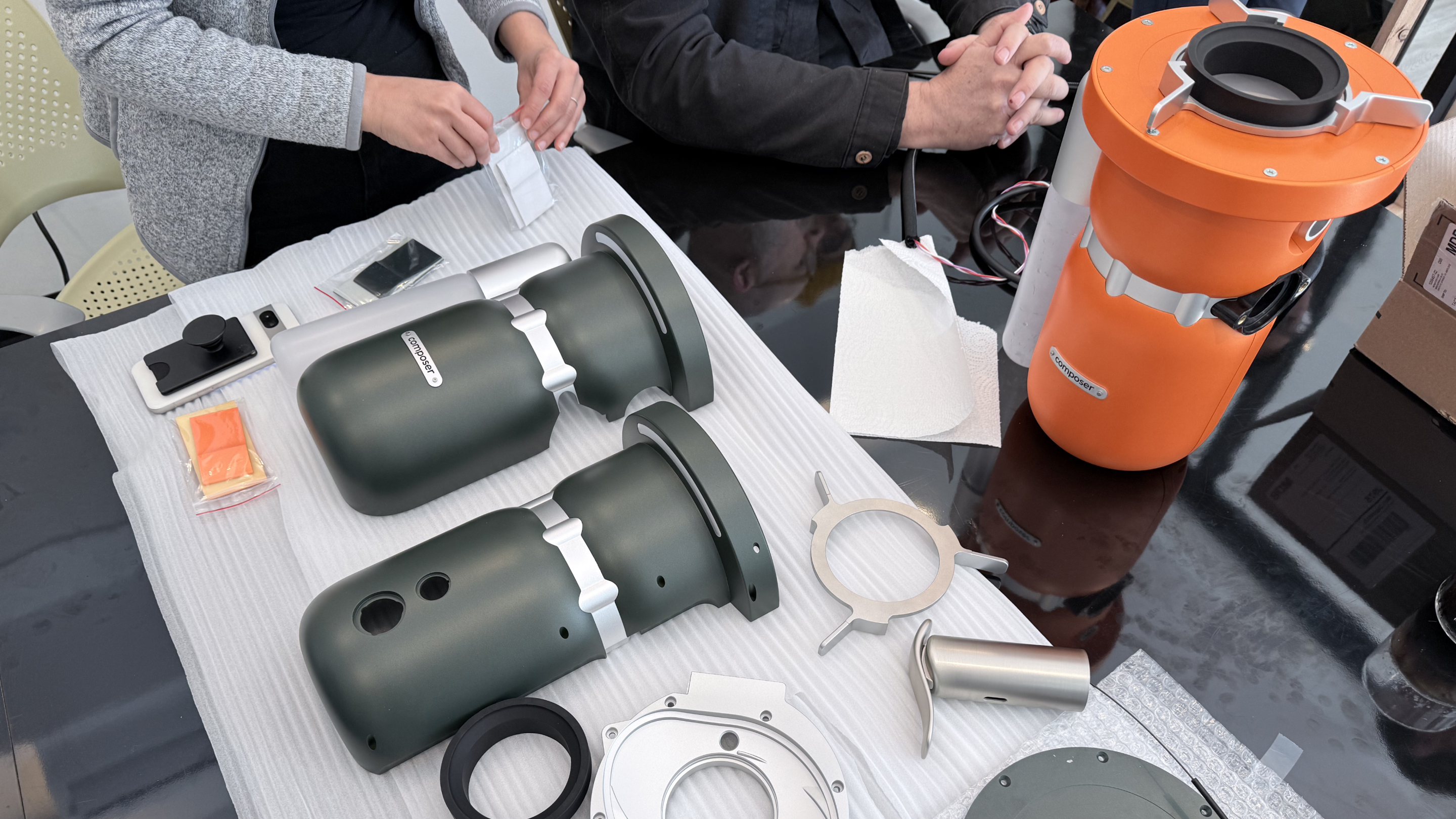
Composer came to us as a product concept and left as a fully unified brand. But that transition wasn't sequential. The industrial design, the CMF, the brand identity, and the digital experience were authored in parallel, each informing the others as the project progressed. A color direction would shape the brand's visual tone. A brand positioning decision would push us to reconsider a surface detail. The work moved back and forth, and the coherence of the final product reflects that.
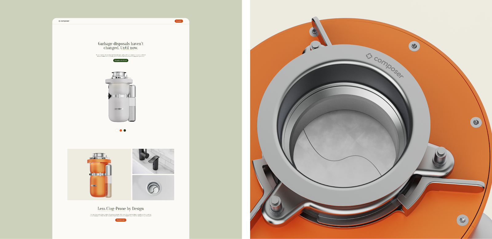
Traditional disposals market themselves on performance metrics: horsepower, grind speed, noise ratings. The messaging is functional, almost macho. Meanwhile, the emerging composting category leans entirely on values and emotion, sustainability, waste-free living, kitchen wellness. Composer sits between those two worlds. It has the power (a 1.0 HP high-torque motor, automatic water flush, bio-enzyme injection), but it also has the warmth. The brand needed to hold both.
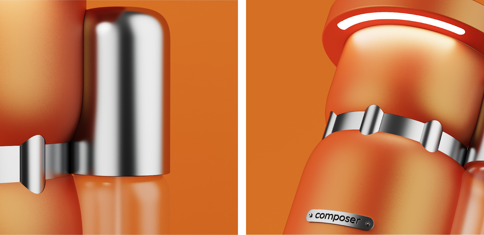
The logo references circular symmetry and the iris form, echoing the geometry of the drain while reinforcing the core innovation. We chose a typeface with perfectly round characters, where the C, the O, and the P all carry consistent radii that echo the product's own curves. It's clean, balanced, and quietly confident, just like the product it represents.
Disposals have traditionally come in neutral tones that prioritize invisibility over identity. We took the opposite approach.
The CMF strategy draws from the foods the Composer processes. Kumquat. Avocado. Kiwi (both the outer skin and the bright inner flesh). Blueberry. Each name ties the product back to its purpose with a wink, playful without being precious, which matched the founder's sensibility. Elevated and classic with a little wit became a north star for the brand. These color choices didn't follow the brand strategy; they shaped it. The warmth and personality of the palette pushed the brand's visual language in directions a neutral product never would have.
The lever offered its own CMF opportunity. We developed finishes in stainless steel, matte black, and brushed brass so that the one visible component at the sink could coordinate with existing faucet hardware. The disposal body brings personality. The lever brings the polish.
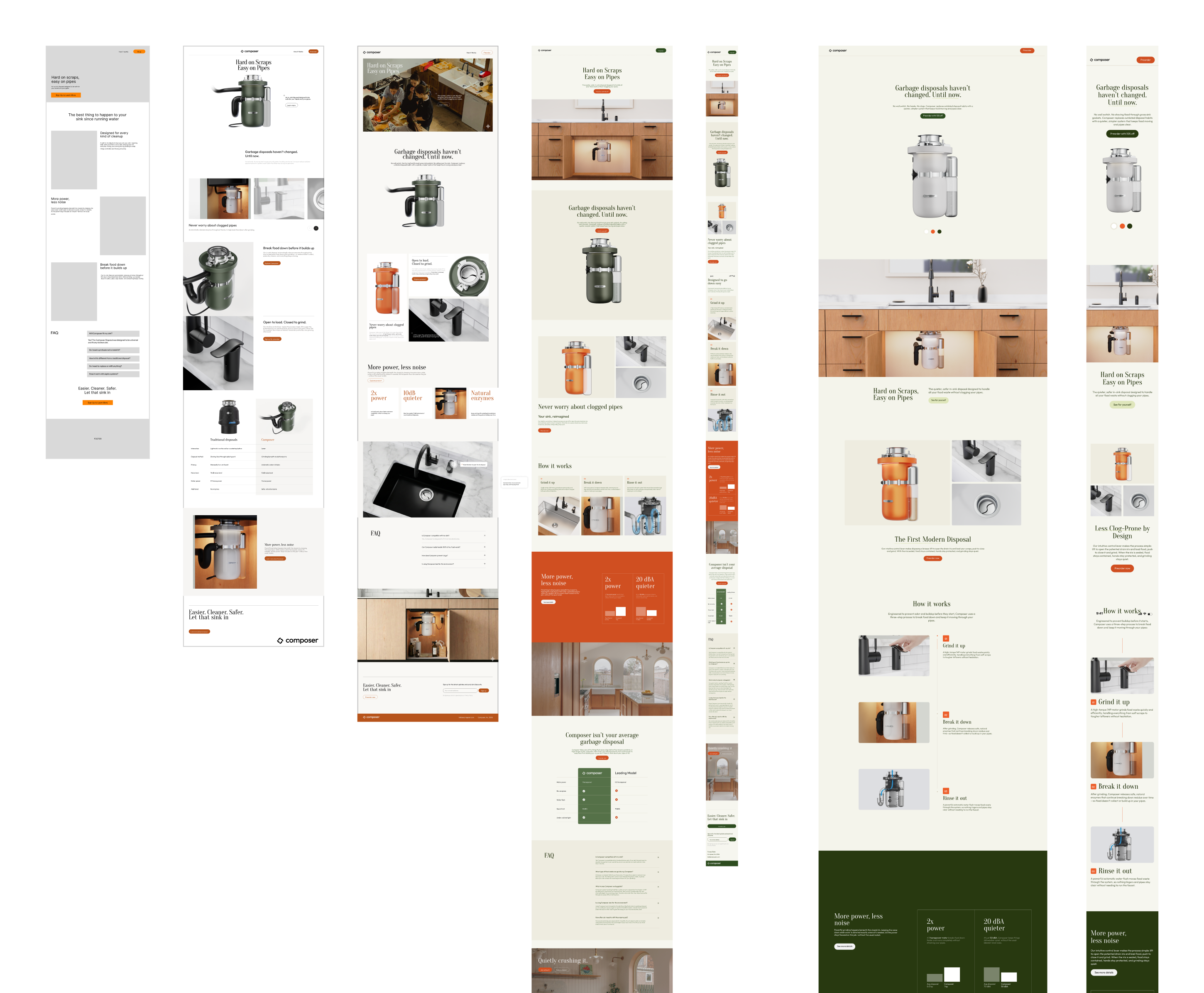
For the website, we designed and developed a narrative experience in Webflow with a Shopify back end for e-commerce. The site lets the product lead: interactive CMF selectors, the disposal rendered in aspirational kitchen contexts, and a clear walkthrough of the lever's three states. We spent considerable time refining the copywriting, tuning the tone to match the founder's vision. Reliable but not boring, playful but not juvenile. A product you'd trust in your kitchen and enjoy telling someone about.
Composer is a reminder that many design opportunities live in the places most people have stopped looking. The in-sink disposal has been hiding under the counter for decades, unchanged and unexamined. The founder saw that gap. Our job was to help fill it, not just with a better-looking product, but with a coherent system of form, interaction, color, brand, and experience that treats this overlooked appliance as something worth caring about.
The best design work doesn't just improve a product. It reframes a category. And sometimes, that means starting under the sink.
Share this article


.svg)