


Most rebrands answer to one audience. The Helper Bees had to answer to two.
By 2030, one in five Americans will be 65 or older, and the vast majority of them want to stay at home and maintain their independence as they age. The Helper Bees runs a credentialed network that helps address this reality, by providing older Americans with the infrastructure and services enabling them to stay in their own homes. On one side sit the payers, the insurers and health plans who fund the service and judge it on functional terms: predictable outcomes, measurable return, operational efficiency. On the other side sit families, who judge it on feeling and concern for their loved ones. Two audiences that need to trust the same brand.
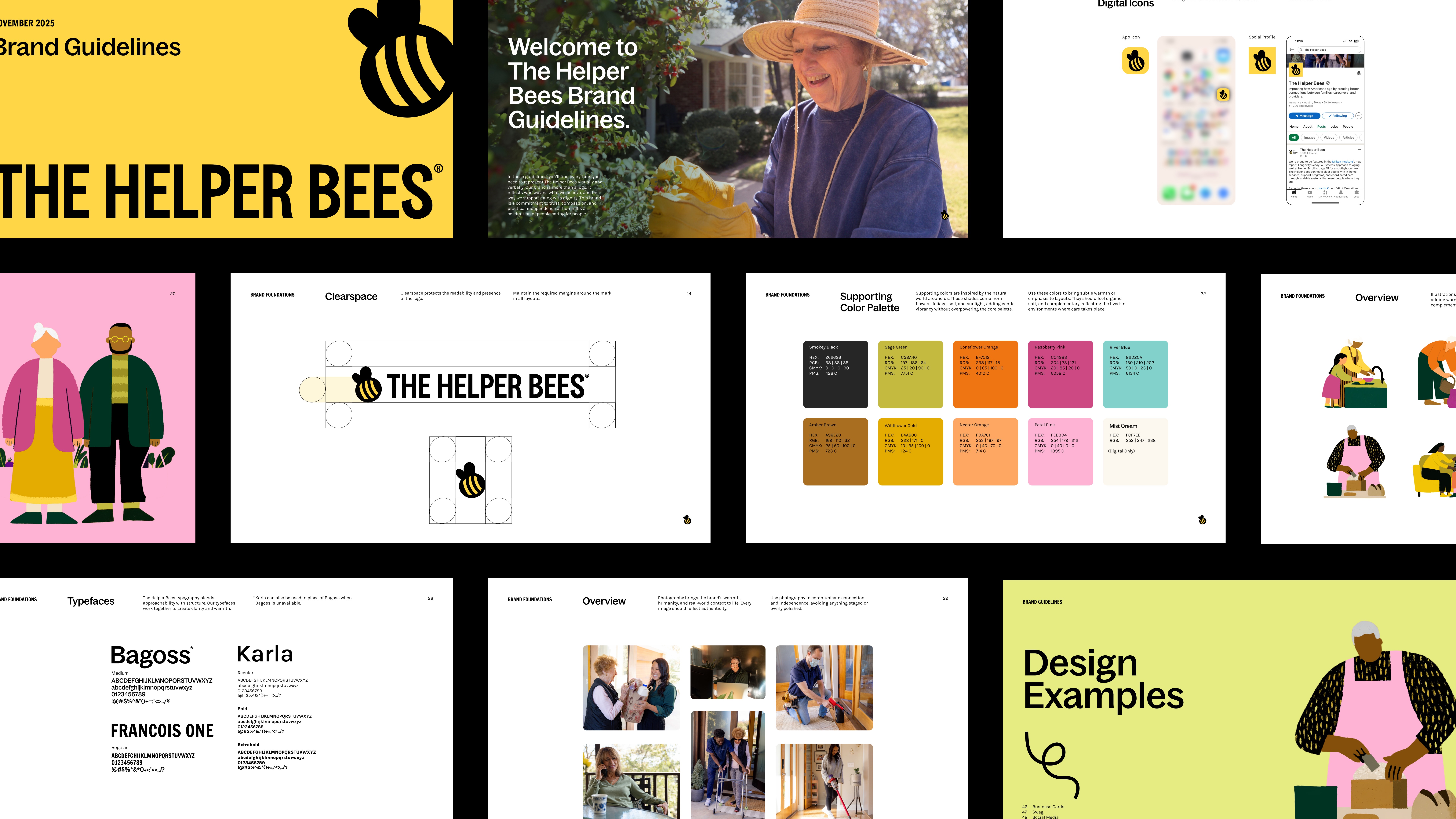
The Helper Bees team came to us at a real milestone: after a decade of building a serious platform, their brand had never caught up. While the product was mature, the brand undersold both the competence and the personality the company had earned. We worked with their team on a full rebrand across brand strategy, visual identity, and website.
Positioning is where a split audience gets won or lost. Pick a message that flatters families and payers tune out. Build one for payers and families don’t feel seen. The tempting move is to compromise, but a bland middle message reads as untrustworthy for both sides.
What works better is a single idea each audience can read in its own language. We landed on the positioning narrative of “The Infrastructure of Independence.” A payer hears "infrastructure" and thinks scale, reliability, systems that hold up under load. A family hears "independence" and thinks about the one outcome they care about. Same positioning, with language that speaks to both.
If you're staring at your own version of this, use a simple test. Does your core idea say something true and specific to each audience without asking either one to translate it? If you find yourself explaining it differently to each group, you don't have one positioning yet. You have two, and they'll pull the brand apart.
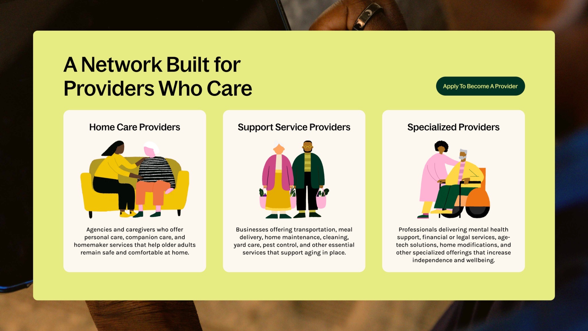
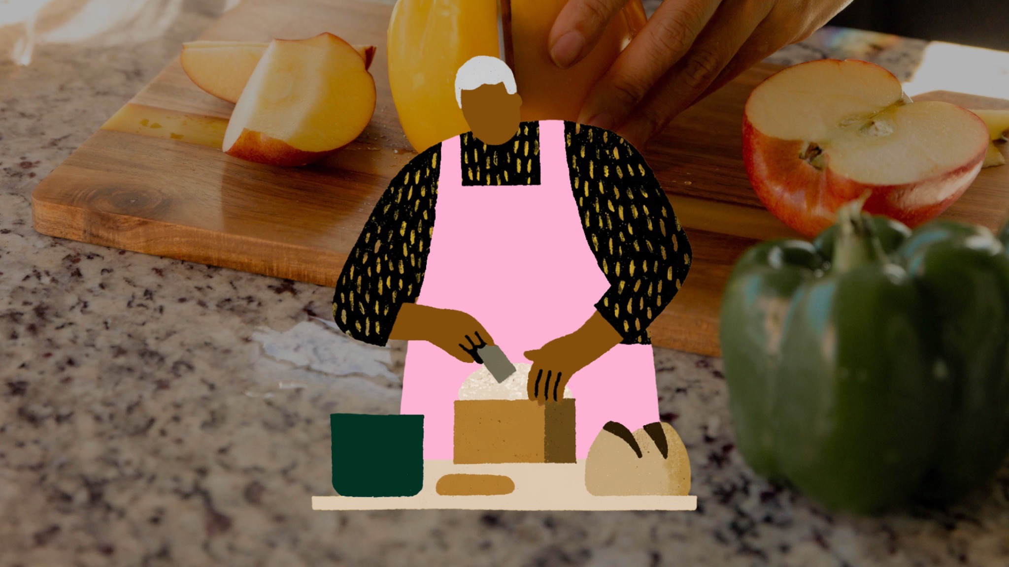
From strategy we moved into brand personality, built around a single idea we called The Connector. The Helper Bees sits in the middle of an ecosystem, between families and caregivers, between what providers can offer and what payers will fund. The brand identity had to make that role visible.
The hard part was holding clarity and warmth at the same time. A payer won't trust a platform they can't understand. A family won't rely on a system that talks over their head. So we wrote down two questions and ran every decision through both of them. Is this clear? Does it feel human? Photography, illustration, color, and copy all had to pass both checks or go back.
That two-question filter is worth borrowing for your own work. Most teams lean hard toward one side while neglecting the other. Designers chase warmth and lose rigor. Enterprise brands chase rigor and turn cold. Naming your non-negotiables and holding every choice against them is what keeps the work from drifting.
We also built on the brand's existing equity instead of scrapping it. A ten-year-old company has recognition worth protecting. We treated the project as a reintroduction, not a reset, so customers would see the same company grown up rather than a stranger wearing its name.
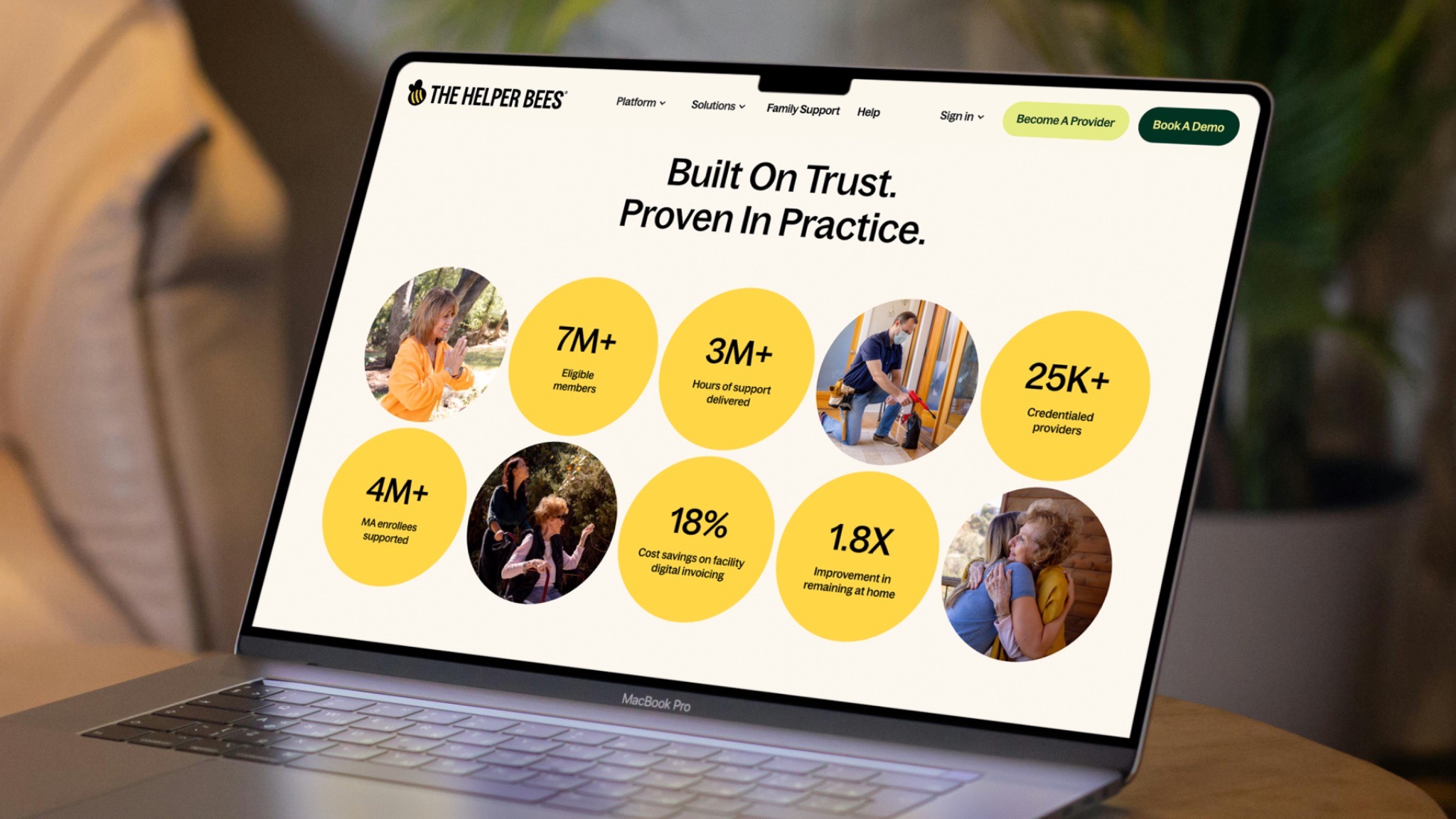
The website is where the two audiences collide, which makes it the toughest surface to get right. Payers arrive to evaluate the platform. Members arrive to reach their benefits. One site, but with two jobs that barely overlap.
We started with information architecture, reorganizing the site so a payer and a member each get an obvious path from the second they land. From there we shaped content and hierarchy page by page, built dedicated landing pages for each audience, and designed a new set of web components so pages could change their message while staying identical in system. Then we moved the site off of WordPress and onto Webflow, which handed the team a cleaner site they can update without a developer on call for every edit.
The principle underneath all of our work was a clear structure, with the ability for flexible messaging. The voice, the hierarchy logic, and the design system stay fixed across the entire site. The message flexes to whoever's reading. That way a payer and a member can take completely different routes and never feel like they've left the same brand.
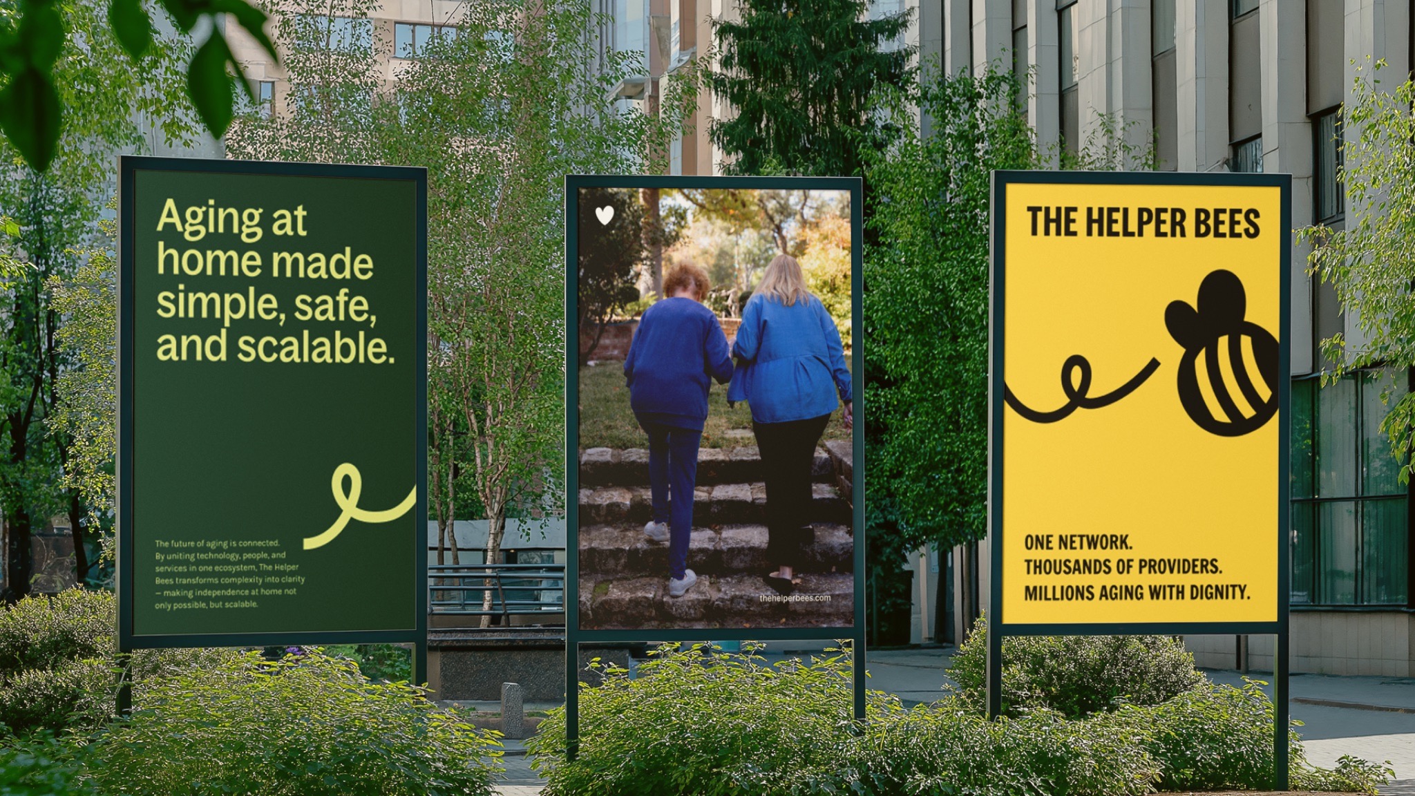
Oftentimes, a rebrand can float away from what it's supposed to sell. Even with sharp visuals and clever copy, you still need a real line back to the product doing its job. We kept pulling the site back toward the actual digital platform, showing it in action rather than describing it in the abstract.
The landing pages give each audience a concrete reason to keep reading. The design system keeps every future campaign and page consistent without a designer rebuilding the wheel each time. And a straight line runs from what the brand promises to the product that keeps the promise. That connection is what makes the marketing that comes after the launch believable instead of hollow.
Here's the part that carries over to any split-audience problem. You don't win two audiences by splitting the difference between them. You win by finding the one idea both can believe, holding it steady, and letting everything on the surface adapt to the person in front of you. Do that well, and two groups who share almost nothing can end up trusting the same name.
Share this article


.svg)
.svg)