
When you’re evaluating a new product idea, the hardest question is rarely “does it look good?” It’s “does this actually work, and will anyone use it?”
Many early product demos and prototypes are created to communicate intent, not behavior. They’re useful for internal alignment and early conversations, but they often break down when put in front of real users, investors, or partners. Interactions feel scripted. Data is simulated. Complex behaviors are implied rather than experienced.
As products become more dynamic and system-driven, especially those involving real-time data, complex user interactions,3D environments, or user-generated content, this gap becomes more visible. People can sense when something is being faked. They stop exploring it naturally and start probing for cracks. Feedback shifts from meaningful product questions to surface-level reactions.
Over the years, teams have tried to close this gap with more sophisticated prototypes and demos. These efforts help, but they rarely change the underlying limitation. Most early-stage artifacts are still representations of products, not functional versions of them.
For moments like validation, proof-of-concept work, investor demos, or real user testing, that distinction matters. In those situations, building something that actually works, even at a basic level, can be more valuable than showing something that only looks complete. This is where vibe coding becomes useful. It enables teams to create functional, credible product experiences quickly, without the cost, complexity, or timelines of a full engineering build.
We were approached by a startup building a connected product ecosystem for scuba divers. Their immediate goal was a trade show demo, something attendees could actively explore at a booth. A key requirement was a working digital app prototype that people could actually use, not just watch.
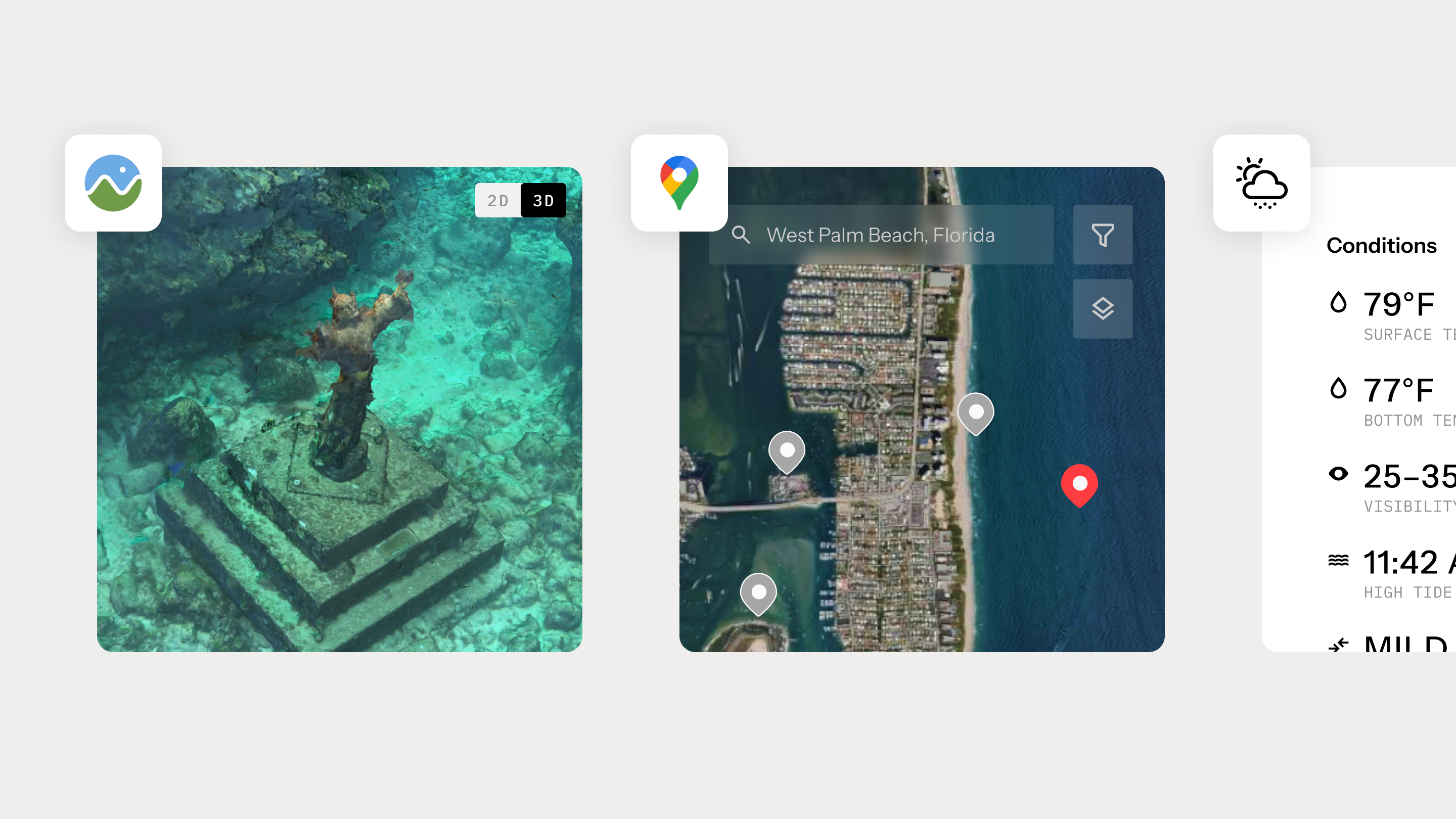
The app itself came with a set of non-trivial requirements. It needed to support 3D underwater maps showing real topography that users could rotate and explore. It required interactive surface maps with custom pins, clustering, and route drawing. Live weather data had to be tied to specific dive locations. On top of that, the system needed a functioning database to support waypoints, dive plans, and early social features.
At first glance, this sounded familiar. We’ve supported trade show demos before. But once we looked closer, the gap became obvious. No prototyping tool could simulate the functionalities authentically. Figma couldn’t handle true 3D interaction. The maps required real-time API responses. User-created data needed to persist across sessions. This wasn’t primarily a visual challenge. It was a behavioral one.
At that point, there were really only two options. We could build a traditional Figma prototype and approximate the experience with videos and carefully staged screen sequences, or we could try to build something real enough to withstand hands-on use at the trade show.
We proposed using vibe coding to build a functional web application rather than a traditional Figma clickable prototype.
The client raised reasonable questions around execution risk, reliability in a live environment, and whether it was possible to deliver meaningful interactivity within a short timeline. These were the same considerations that typically shape any early product decision.
We addressed these concerns by being explicit about tradeoffs. A traditional prototype would give us tighter visual control, but it would not support the interactions that actually differentiated the product. The 3D navigation and route planning were not secondary features. They were central to how the product worked. Simulating them would have limited both the usefulness of the demo and the quality of feedback it could generate.
We aligned on a simple priority. Functionality came first, refinement followed. That decision kept the scope focused and ensured the result could be used, tested, and evaluated in real conditions, rather than just reviewed.
We structured the work in three phases. Get it working, make it coherent, then pressure-test it.
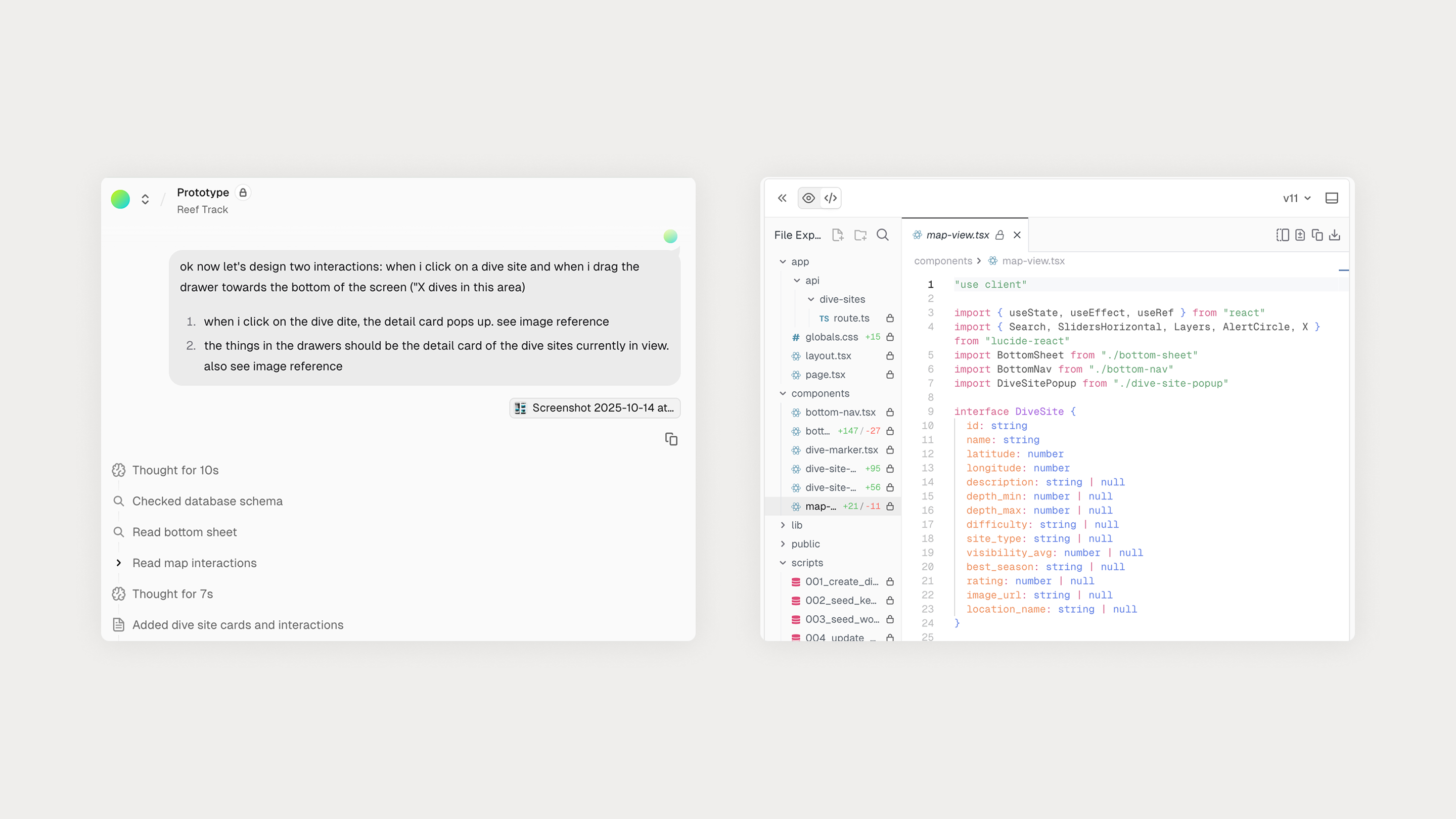
Our first priority was straightforward. Implement the required behaviors end to end before worrying about visual polish.
The surface map feature alone introduced meaningful complexity. What initially appears to be “just a map” quickly becomes a series of intertwined UX and technical decisions. How to cluster pins without losing clarity? How the map should respond when a user selects a location? How to draw routes between waypoints? How to manage cached data for performance? How to layer depth contours over different terrain views?
AI accelerated execution, but it didn’t replace understanding. The Google Maps API is dense and context-dependent. We had to study the documentation ourselves, determine the right approach, then guide AI with highly specific instructions tied to exact methods and parameters. The working pattern became consistent. Research first, direct second.
The 3D map was another feature area where things started to break down. Using Cesium to render underwater terrain, we ran into issues where assets failed to load, rendered incorrectly, or crashed the app entirely. These were not problems AI could diagnose on its own. We had to dig through documentation, GitHub issues, and forum threads to understand what was actually happening and why certain configurations were unstable. This work still depended on human judgment. Once the root causes were identified, AI was invaluable for implementing fixes quickly and iterating without friction.
By the end of this phase, we had a working application. Live database integration via Supabase. Real-time weather data. Interactive 2D and 3D maps. Persistent user-generated content. It wasn’t refined, but it behaved like a real product.
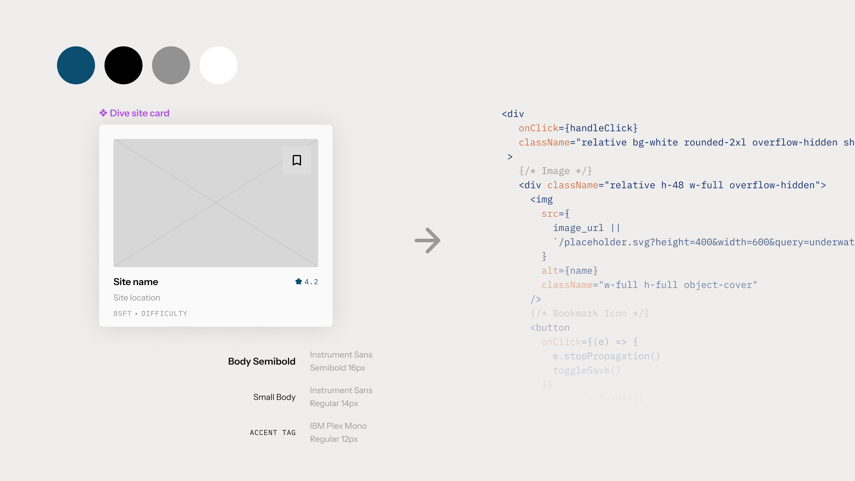
With the system stable, we translated the Figma designs into the live app.
We established design tokens for color, typography, and spacing, built reusable components, and normalized layouts across screens. This is where AI’s limitations became more apparent. It would solve tasks functionally, then quietly undermine the system by hardcoding values, misaligning elements, or ignoring established patterns.
Correcting this required a more surgical approach, inspecting the DOM, identifying the element at fault, and issuing targeted corrective prompts. Tools like Vercel’s visual component targeting helped, but responsibility for coherence and quality remained with the team.
One unexpected benefit of this phase was insight. Seeing the design operate in a real flow surfaced navigation issues, state gaps, and interaction friction that would have been difficult to spot in static mockups alone. The prototype didn’t just communicate the idea. It helped surface problems earlier and more clearly.

Before the trade show, we put the app in front of real users. The goal wasn’t perfection. It was resilience.
That testing surfaced edge cases, performance issues, and interaction failures we could address ahead of time. By launch, we weren’t guessing whether it would hold up. We knew it would.
AI handled much of the execution, writing CSS, connecting APIs, scaffolding components, and accelerating repetitive setup work. This made it possible to build something complex in weeks rather than months.
What AI did not do was design. It did not determine hierarchy or emphasis, understand when restraint was needed, or consistently apply the design system without oversight. It also could not judge when additional refinement stopped being meaningful for validation.
Those decisions remained human. We directed the work, evaluated tradeoffs, and refined the experience, while AI functioned as the execution layer. The closest comparison is a junior developer who works continuously, moves quickly, and requires clear guidance to produce consistent results.
The designer’s role did not disappear. It broadened to include stronger direction, judgment, and systems thinking throughout the build.
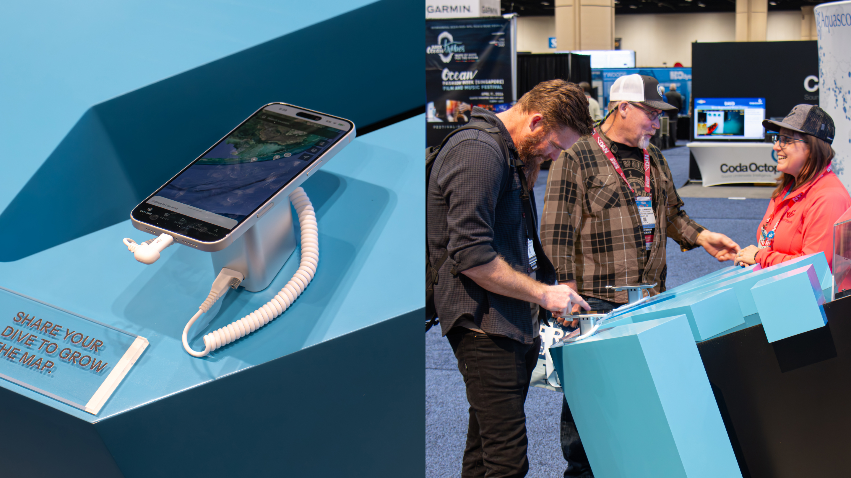
The app launched publicly at an industry trade show in Florida. Attendees didn’t treat it as a demo. They interacted with it as a product. The most-used feature was the route planner, where divers plotted and adjusted dive paths in real time. As they explored the tool, they began asking for enhancements such as searching waypoints, tagging entry and exit points, and refining routes.
That kind of feedback only emerges through real use. A clickable prototype would not have prompted the same level of engagement or insight.
The client shared updates throughout the show. The application held up under sustained use and drew attention from established players in the industry. When issues did surface, we addressed them quickly, deploying updates remotely as the event was underway.
These issues were not failures of planning. They reflected real-world complexity and usage patterns, which is exactly what this type of early exposure is meant to reveal.
For teams looking to validate ideas quickly, build credible proof-of-concepts, or put something real in front of users and investors, embracing AI-coding tools changes the economics. It reduces handoffs, avoids heavy infrastructure, and compresses timelines. Instead of describing how a product might work, design teams can show something that actually does, well enough to support informed decisions.
Traditional engineering and long-term development are not replaced. They are supported. By resolving uncertainty earlier, teams move into full development with clearer direction, stronger evidence, and fewer assumptions.
Vibe coding is a way to use AI to assemble functional product experiences early, when learning is most valuable and change is least expensive. For products where behavior matters as much as appearance, the difference is practical rather than theoretical. It shapes what teams learn, how confidently they invest, and what they choose to build next.